


Airline Logos are very important because it defines the culture of particular brand and the country they belongs to. Each and every Airline Logo design has one interesting story behind it. Some Airline Logos designed accidently or some has very deep analysis and other metrics involved. When you design logo of popular airline company then you need to understand various factors and after effects of it as well. Millions of users across the world will witness airline logo on airplane, flights, airports, advertisements, banners, newspapers, tv, social media platforms and other advertisement platforms as well.
Today we have compiled list of some popular airline logos of the world and the story behind it’s design
Table of Contents
15 Best Airline Logos of the World
#1 Qatar Airways Airline Logo
Country – Qatar
Qatar Airways logo was designed back in 2006 which feature a burgundy oryx on a grey background after the text. The color of Qatar Airways logo matches the color of Qatar flag and the Oryx is the national animal of Qatar thus it’s been used in logo as well. Qatar Airways is one of the most popular airlines of the world because of their services. In Qatar Airways logo name is written in English and in Arabic letters it’s written “Al Qataria”.
#2 Lufthansa Airline Logo
Country – Germany
The original Lufthansa logo was created back in Otto Firle back in 1918 having flying crane in a circle. In 1954 this logo was officially adopted as Lufthansa Airline Logo. Lufthansa Airline logo is very simple and uses a custom typeface.
#3 Egyptair Airline Logo
Country – Egypt
If it’s Egypt then every logo or art will be based on their culture and mythology. Egyptair’s logo is inspired by their ancient Egyptian Mythology, it draws the image of Horus (Not whole body just his head). Horus is knows as god of sun and his body has Falcon’s head. Egyptair is using this logo since 2008.
#4 Japan Airlines Logo
Country – Japan
The logo of Japan Airlines has red color which symbolizes happiness. Japan Airlines Logo (JAL) was designed by Jerry Huff back In 1958. This logo is called as “tsurumaru” or “crane circle” because it has Japanese Crane with extended wings. In Japan the crane is the symbol of long life, prosperity and good health and that’s the main inspiration behind this logo. Japanese people says that crane has the capability to fly very high and very long without getting tired and it’s the perfect symbol for airline as well. In 2002 Japan Airlines revealed new logo but it’s not accepted very well amongst their customers thus they decided to use old logo.
#5 Srilankan Airlines
Country -Sri Lanka
Srilankan Airlines logo has wonderful and styling flying peacock with elegant typeface. In 1999 during major rebranding project this logo was revealed and accepted very well. According to Sri Lankan flying machine similar to peacock once existed and it was called the Dandu Monara Yanthra. Peacock’s are the native species of Sri Lanka and it’s wonderful country.
#6 Emirates Airlines
Country – United Arab Emirates
Emirates Airlines is considered as a most luxurious airline of the world. The Emirates Airlines logo was created by Negus & Negus Associates back in 1985. Emirates logo is extremely simple logo written in red and white color. In this logo “Emirates” is written in English where as intricate Arabic lettering is there as well. Red color symbolizes leadership, passion, prosperity and self confidence thus they used this color in their logo. The other color white symbolizes elegance, purity and nobility.
#7 Air Canada
Country – Canada
Air Canada Airlines logo is extremely simple designed in red & white color. Air Canada logo has the national symbol of Canada – encircled maple leaf. Air Canada’s logo was first presented in October 2004 and it’s designed by Futurebrand worldwide.
#8 Hawaiian Airlines
Country – USA
Hawaiian Airlines Logo is extremely unique because it doesn’t consist and other object, animal or bird but a person. Hawaiian Airlines logo was designed by Lindon Leader in 2001. This Hawaiian Airlines logo has island girl Pualani which also known as Flower of the sky.
#9 Thai Airways
Country – Thailand
Interbrand designed the Thai Airways logo back in April 2005. This logo features a colorful ornament in which pink object represents a magnolia blossom.
#10 American Airlines Logo
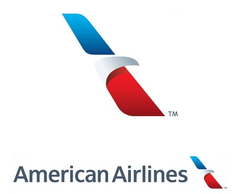
Country – USA
In January 2013 American Airlines revealed their new logo designed by FutureBrand. It’s designed in traditional American colors – Red, Blue & White. If you look closely in logo then you will see the abstract of flying eagle.
#11 Air Asia Logo
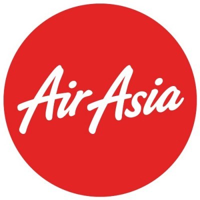
Country – Malaysia
Air Asia Airlines logo is very eye catching because of beautifully crafter fonts. Air Asia logo is simple consists red and white color. Air Asia logo was designed by Start Creative.
#12 Air India Logo
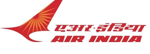
Country – India
Have you seen the wheel of Konark Sun Temple ever? Well not then I will tell you something about it now. Air India logo represents red flying swan with Wheen of Konark Sun Temple in orange color on Swan’s wings. This logo is extremely beautiful and it’s designed by DMA branding in 2007. Air India is also famous for their mascot Maharajah which was created by Bobby Kooka and Umesh Rao in 1946.
#13 Swiss Airlines Logo

Country -Switzerland
Swiss Airlines logo is designed by Nose Design in 2011. SWISS is actually Swiss International Airlines but popularly known as SWISS. SWISS Logo has plus symbol in white color with red background and it’s inspired from Switzerland national flag. This logo has Univers 65 bold font by Linotype.
#14 Turkish Airlines
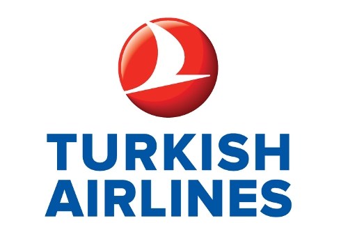
Country – Turkey
Turkish Airlines launched this logo in 2010 as a part of rebranding or redesign by Priestmangoode. This logo consists red, blue and white color and very professional.
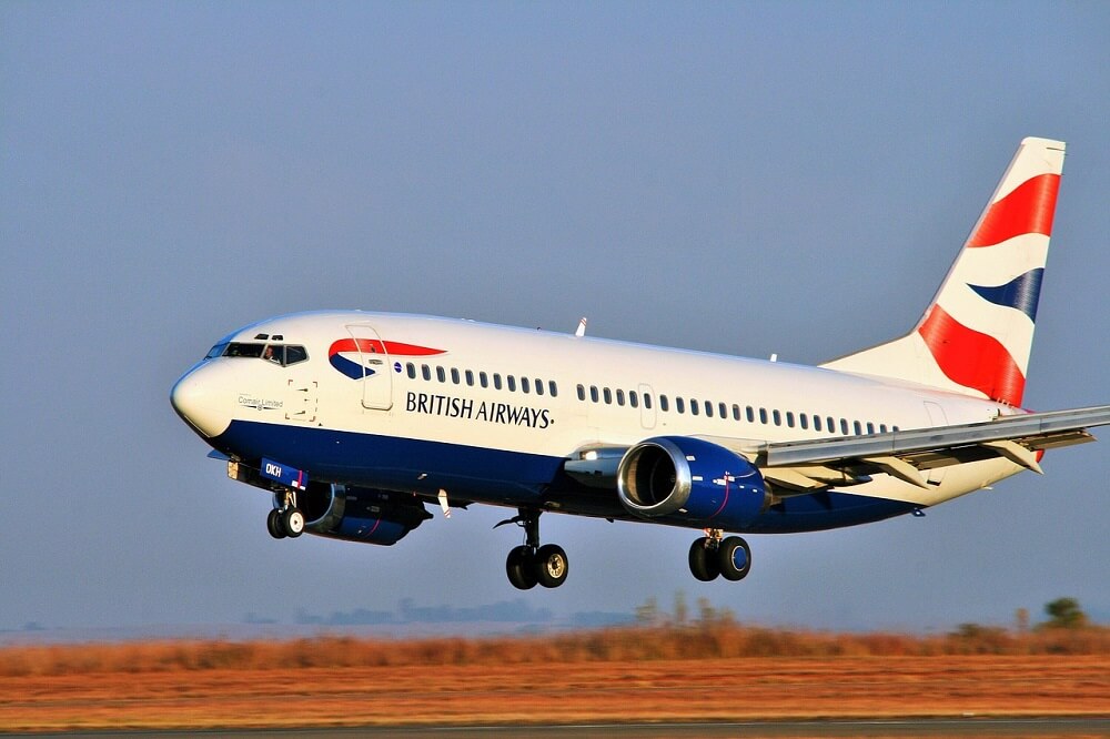
#15 British Airways
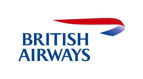
Country -England
British Airways has the most popular logo in the world which still consists the Speedmarque in it and it’s designed by Newell & Sorrell in 1997. It’s inspired by the old “speedbird” symbol which was used during World War II by British Air Force.


